We sometimes get asked by prospective customers kicking the tires on a Donor Engagement software solution, ‘What’s so special about DonorPoint’s capabilities?’ We actually love the question, and are always eager to tell our story on what makes us unique.
Our answer?
By easily facilitating ANY ask you can possibly make of your constituents, we can help you raise money more effectively than you ever have before.
In this month’s blog we’ll take you step-by-step through how we help engage your donors by leveraging your story, giving them a seamless experience — and making the impact of that engagement work harder than ever for you.
NONPROFIT VS. E-COMMERCE: HOW DO THEY COMPARE?
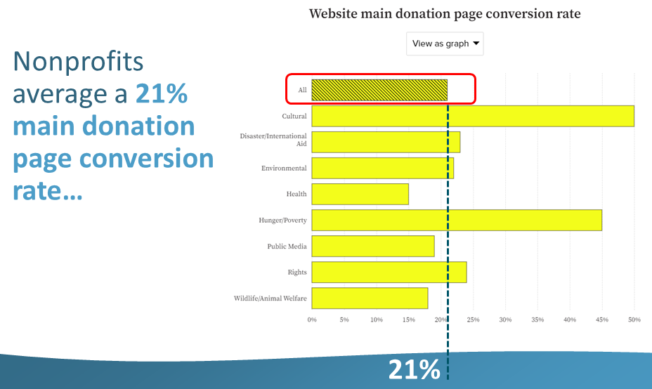
According to a June 2021 M+R Benchmarks study of 220 U.S. Nonprofits, one-fifth of potential donors who reached the donation page wound up donating at the end of the visit — meaning that, for whatever reason (perhaps the website was not aesthetically appealing or user-friendly, too many steps to complete, being asked to provide too much information, etc.), four-fifths did not.
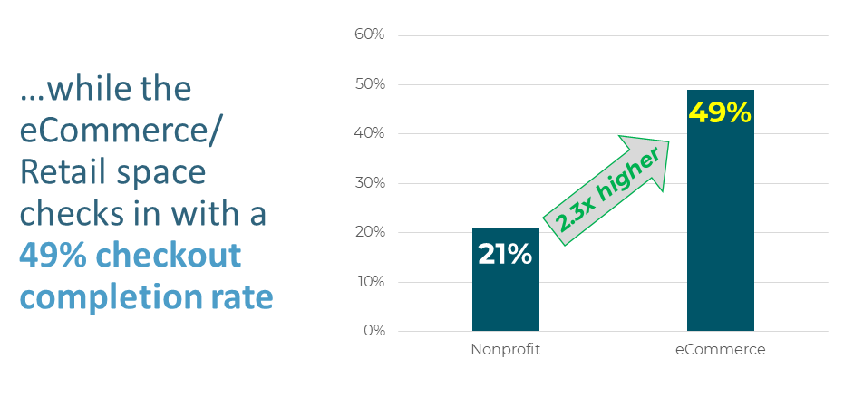
How does the eCommerce/Retail space compare? Much too favorably, according to a November 2021 Littledata survey of nearly 3,000 online Retail stores. Littledata’s research found that eCommerce’s checkout completion rate (the Retail equivalent of Nonprofits’ donation conversion rate) checked in at a whopping 49% — 2.3x higher than the Nonprofit space. (eCommerce leader Amazon’s 74% Prime Member rate — as reported by Sellerapp — surely buoys this figure….although even non-Prime Amazon purchasers still hit at or around 50%, as do Apple, Wal-Mart, eBay and Microsoft.)
WHY SHOULD WE CARE ABOUT E-COMMERCE SITES?
It’s simple: a list of the 50 most visited websites in the world (which each draw between 580 million and 93 billion visitors every single month) is littered with eCommerce sites, but not one Nonprofit site is among them. Translation: it’s not a Nonprofit website user experience that drives a donor’s expectations….but rather the eCommerce site experiences that they have on an everyday basis. When we take a deeper dive, we find some intriguing consistencies in the most successful eCommerce sites, which are designed so that user experiences are:
- Clean
- Easy
- Quick
- Painless
- Inspiring
- Impactful
And THAT is why we pay close attention to eCommerce sites. Donors are shaped by their eCommerce site experiences….and they expect a similar one from Nonprofits. We pull out the best practices, tips, tricks and functionality from eCommerce sites and use them for fundraising — putting the tools for success into your hands. Our goal is to ensure your donors’ experience is just as successful as the best of the eCommerce sites.
MORE WAYS WE ENSURE YOUR SUCCESS
We know the features that drive results for your Nonprofit, and we make sure they’re represented in your Individual & Recurring Giving, Workplace Giving Campaign, Events-Raffles-Auctions, Volunteering, Peer-to-Peer & Crowdfunding initiatives and more. Our software is configurable to YOUR business — not the other way around. Donor-facing URLs will feature your name and your name only, so your donors have 100% confidence where their gift is going. Our solutions are easily integratable with the most popular CRMs on the market today. And fully exportable Reporting & Analytics capabilities can be set up however you want. Your dashboards will contain only the information YOU need — no more, no less.
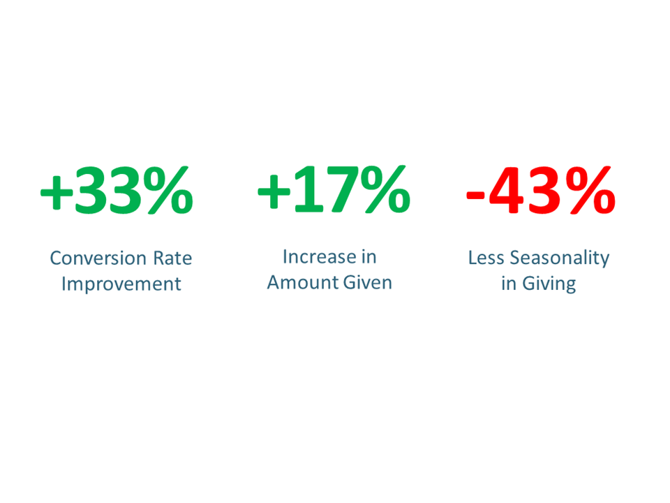
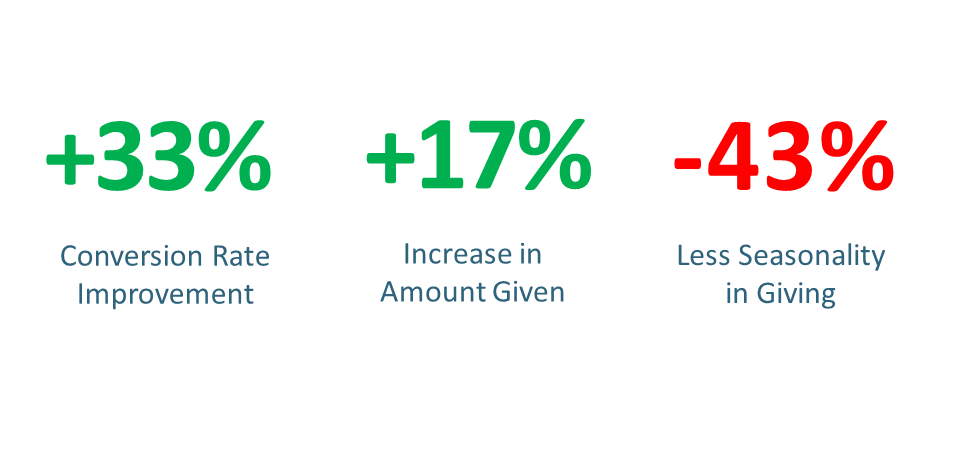
We’ve been employing these principles since our inception in 2011, and the results are unmistakable. Clients have seen their conversion rates improve by +33%, with a +17% increase in funds raised….and with significantly lower end-of-year giving seasonality — meaning more consistent, relationship-based giving throughout the year (and less stress for you at the end of your fiscal year!).
If you have a few minutes we’d love to learn more about your needs and how we can help you reach similar successes as our clients have. Please reach out to us for a quick chat!
